You runnin' fer office?
¡Viva la Bredalución!
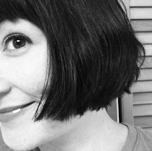
don't like it. Why did you put a B&W pic of Phlegm Fatale on YOUR blog?
TBolt - that is me. Sadly, not as gorgeous as Phlegmmy, but it'll have to do.
Oh, you're both gorgeous!
I LURVES it, Breda - and you're by far prettier than moi, but I daresay we are equally fabulous!
you look annoyed...which I can understand....but...well, you can figure it out, you're a birght gal.
Thanks for the compliment, though, new jovian thunderbolt!
Dig it!
very nice... minimalistic.. :)
What header?Sincerely,-An RSS user
It's lovely, Breda.
oOoOoh fancy! i feel like i'm looking UP at you even though i'm eye to eye with my computer. good job! hehee.
I dunno... kinda STARK.Missing something??Ah HA! No dimples!
More color please, it might load quickly but does it say anything about you? And, I can't remember what the other one was like - I dive straight for the blogs and what I have been missing.
Shiny!!
I believe that, as in the real world, it's whats on the inside that counts.
You are one of those damn lucky woman whom, like my wife, you couldn't take a ugly picture.
I like it! It is artsy, in a good way.
I like it, but your profile thumbnail is even better.
What? No Chthulu hat?BSN: it's great. But what matters is that YOU like it.M
What Mike W said, above.You need something incorporating a smile, a gun, and those fabulous nails...heh
I'm thinking doubletrouble is right. That's why I didn't recognize you - no dimples.I like artsy, but I think this one is a bit minimalist for me.And the frame makes you look a bit contained. As if you were looking out from inside. I've always pictured you more as a force of nature.But really, what you like is what we want to see. We're just flattered you asked our opinions.
I will agree that the thumbnail photo is better than the on on the header and that I don't often look at the header of blogs anyway.
Oh, and you got rid of the kickass evil gunchick photo on the sidebar.
scroll down, MikeW, it's still there.
D'oh! I'm not too quick today. Hectic day at work.
You look like Patty Hearts in that pic. Sorry.
Post a Comment


29 comments:
You runnin' fer office?
¡Viva la Bredalución!
don't like it. Why did you put a B&W pic of Phlegm Fatale on YOUR blog?
TBolt - that is me. Sadly, not as gorgeous as Phlegmmy, but it'll have to do.
Oh, you're both gorgeous!
I LURVES it, Breda - and you're by far prettier than moi, but I daresay we are equally fabulous!
you look annoyed...which I can understand....but...well, you can figure it out, you're a birght gal.
Thanks for the compliment, though, new jovian thunderbolt!
Dig it!
very nice... minimalistic.. :)
What header?
Sincerely,
-An RSS user
It's lovely, Breda.
oOoOoh fancy! i feel like i'm looking UP at you even though i'm eye to eye with my computer. good job! hehee.
I dunno... kinda STARK.
Missing something??
Ah HA! No dimples!
More color please, it might load quickly but does it say anything about you? And, I can't remember what the other one was like - I dive straight for the blogs and what I have been missing.
Shiny!!
I believe that, as in the real world, it's whats on the inside that counts.
You are one of those damn lucky woman whom, like my wife, you couldn't take a ugly picture.
I like it! It is artsy, in a good way.
I like it, but your profile thumbnail is even better.
What? No Chthulu hat?
BSN: it's great. But what matters is that YOU like it.
M
What Mike W said, above.
You need something incorporating a smile, a gun, and those fabulous nails...heh
I'm thinking doubletrouble is right. That's why I didn't recognize you - no dimples.
I like artsy, but I think this one is a bit minimalist for me.
And the frame makes you look a bit contained. As if you were looking out from inside. I've always pictured you more as a force of nature.
But really, what you like is what we want to see. We're just flattered you asked our opinions.
I will agree that the thumbnail photo is better than the on on the header and that I don't often look at the header of blogs anyway.
Oh, and you got rid of the kickass evil gunchick photo on the sidebar.
scroll down, MikeW, it's still there.
D'oh! I'm not too quick today. Hectic day at work.
You look like Patty Hearts in that pic. Sorry.
Post a Comment